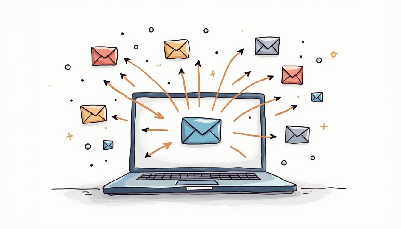
How to Forward Email in Google Groups: A Step-by-Step Guide
Easily forward Google Group emails to other tools for customer support, sales, or any other business needs
Read the latest articles about customer support and team collaboration
Easily forward Google Group emails to other tools for customer support, sales, or any other business needs

Streamline your team's communication with an Office 365 Shared Mailbox! Perfect for customer support or internal coordination, it allows multiple users to manage emails from a single address without needing extra licenses. Check out our latest blog for a step-by-step guide on setting it up!
Copy-paste canned response templates for customer service teams. Ready-to-use examples for greetings, complaints, refunds, technical support, and more.

Learn how to automate your Gmail emails for better organization and increased productivity. Discover methods like filters, labels, scheduling, and more to streamline your inbox management.

Discover everything about Google Docs - from features and pricing to real-time collaboration tools. Plus, see how it stacks up against Office 365 to help you choose the right platform.

Tired of switching between Gmail accounts? Discover how to view all your emails in one inbox and improve productivity with easy-to-follow steps and organization tips.

Complete guide to creating a shared mailbox in Google Workspace. Learn both delegation and Collaborative Inbox methods with step-by-step instructions.

Learn 3 ways to create a shared inbox in Gmail: delegation, Google Groups, and third-party tools. Step-by-step 2025 guide with screenshots and troubleshooting tips.

Operating multiple Gmail accounts? Discover how to merge them into one inbox with email forwarding and data importing for a more organized workflow.

Learn how to set up Google Groups as a collaborative inbox to streamline team communication, assign tasks, and track inquiries all in one place.

If your email is hosted on Google, you can easily use Google Apps Script to automate tasks like mass downloading image attachments. Even if you’re not a developer, it’s a simple process: just copy and paste the provided script. Start by logging into the Google Account associated with the email you want to use for this task. Once logged in, you can quickly set up the script to download image attachments from your Gmail. Follow the guide at Google Apps Script to get started—it’s user-friendly, e

Learn how Google Workspace and Office 365 compare in terms of apps, storage, security, and integrations. Plus, explore a customer support alternative.

Want to email multiple people at once? Find out how to set up group emails in Gmail with easy-to-follow steps, tips, and helpful alternatives.

Overwhelmed by your Gmail inbox? Follow these 15 tips for organizing emails, from customizing layouts to archiving old messages.

Customer engagement is vital to your business's success. Here's what you need to know about customer engagement, why it matters, and how to improve it.
![Building a Customer-Centric Culture: 6 Ways to Make It Real [2025]](https://public.supportbee.com/img/blog/2024-09-09-how-companies-can-build-a-customer-centric-culture/supportbee-customercentric.png)
Only 14% of companies are truly customer-centric. Learn how to build a customer-centric culture through values, hiring, training, and technology.

Want to improve the customer experience? These 4 proven customer experience strategies work every time.
![How to Build a Customer-Centric Strategy: 7 Proven Steps [2025]](https://public.supportbee.com/img/blog/2024-09-07-steps-to-building-a-customer-centric-strategy/supportbee-customer-centric.png)
A step-by-step guide to creating a customer-centric strategy. Learn how to collect feedback, use data, train teams, and develop products that put customers first.

Learn how customer service and marketing teams can work together to provide exceptional customer experiences for your business.

A look at customer retention, how to calculate it, and a few of the most crucial reasons to prioritize customer retention in your business.

Customer satisfaction is a key competitive differentiator today. Use these six proven strategies to create an exceptional customer experience and improve customer satisfaction.

What's the goal of CRM? In this post, we'll discuss the ultimate goal of customer relationship management and how you can use it to your advantage.

Every company wants to minimize customer service complaints, but how can you stop them before they happen? These 6 tactics will help you identify and resolve customer service complaints before they happen.

Teamwork makes the dream work, especially when it comes to customer satisfaction. Here are 6 ways companies are leveraging team collaboration to improve customer satisfaction.
Customer feedback is a valuable resource for every small business. These 50 customer feedback tools help small businesses collect authentic customer feedback to improve the customer experience.
These 50 customer service software tools for customer support streamline your customer support services, from customer relationship management to social media customer support.
Learn about the differences between customer support and customer service, from the nature of the activities to how each is measured.
Want to write knowledge base articles that really help your customers? Follow these tips to write more effective knowledge base articles.

A well designed knowledge base can reduce your customer support costs and deliver better customer service to your customers. We show you how to do it!
Expert customer service tips including training tips, best practices for dealing with difficult customers, how to leverage technology to improve customer service, and more.

A cloud based helpdesk can streamline your customer support and help you deliver better customer service to your customers. Read on to learn more!
Customer relations is the ongoing effort of building and nurturing relationships with customers. Learn more about customer relations and why it matters.
![What Is Customer Support? Definition, Importance & Best Practices [2025]](https://public.supportbee.com/img/blog/what-is-customer-support/hero.jpg)
Customer support is the team and processes that help customers solve problems with your product or service. Learn why it matters and how to do it well.
If you're focused on customer service, considering the customer service experience is a must. Here's what you need to know about providing an exceptional customer service experience.
Ask these six important questions to get better insights from your customer feedback surveys.
Leverage these five best practices to effectively manage your ticketing system for better, more efficient customer support.
These 50 articles on customer service offer expert customer service tips, best practices, industry statistics and trends, and more.
Customer success (CS) takes a proactive approach to customer satisfaction. Learn more about customer success and how to implement a CS program.
Handling customer complaints requires a careful, delicate approach. Use these 6 examples email replies to customer complaints for better results.
Take a look at 4 tips for providing stellar customer support via social media. Create a better social media customer support strategy by following these tips.
Boost your team's email collaboration with features like real-time updates, group privacy, audit trails, personalized signatures, and integrations.
If you've been thinking about implementing a shared inbox for your team, here are six compelling reasons why a shared inbox is an excellent team collaboration tool.
Discover how to improve customer satisfaction with real human-centered guidelines, empathy, and authenticity—going beyond mere metrics.
Learn what customer service really means and how it impacts your business both positively and negatively.
Learn about providing top-notch customer care with these top-quality customer care resources, including blogs, tutorials, books, guides, and more.
Not sure where to begin to develop your customer satisfaction survey? These 50 questions will help you measure every facet of the customer experience.
The interaction between your help desk software and project management is important for effective collaboration
In the early stages of a product, developers are best suited to handle first level tech support.
Looking for a shared inbox for your team? We have compiled a list of 25 best shared inbox tools that you can start using today!
Our 26 experts discuss the top customer service skill that matters. Taking ownership, listening, and other important skills that you can start using today!

Learn the 4 essential customer satisfaction metrics every business should track: NPS, CSAT, CES, and Customer Churn. Improve customer service with data-driven insights.

Learn the best practices for improving your customer service to delight your customers and retain them for years!
A list of the 50 best customer service blogs that you should be reading to improve your customer service game
![What Is a Customer Portal? Benefits, Features & Best Practices [2025]](https://public.supportbee.com/img/blog/what-is-customer-portal/hero.jpg)
A customer portal is a self-service platform where customers can submit tickets, track requests, and access support resources. Learn how to implement one.

Learn 7 ways your customer service team can handle customer complaints to ensure customer satisfaction and happiness
A list of 10 important customer service skills that matter if you are hiring for support or have a client facing job
iProv COO Patrick Laughlin needed a better way to manage the support needs of his company's growing customer base. SupportBee checked all the boxes.
"It is not enough that you have a great product or service. The harsh truth is that it is difficult to keep your customers happy." says Uwe Dreissigacker, founder of InvoiceBerry. Read more in his guest post!